A triptych from the Greek adjective ‘three-fold’, is a work of art which is divided into three sections. Sometimes, a single picture just won’t do and a sequence of photos can do a better job in telling your story. So, a photographic triptych may consist of separate images that are variants on a theme, or may be one larger image split into three images with a plain border between them. It can be images from the same photo session taken in succession, or even opposing subjects showing contrasting ideas.
Yes, this was a challenging assignment – not only to spot the effective subject matter from which to create a triptych, but also to graphically piece the images together to create the final masterpiece. However, yet again, the ACC members were quite creative in their submittals and executed the assignment well! The following four received the most votes from the members.
First Place (17 Votes)
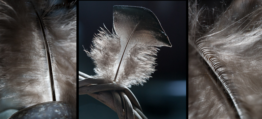
By far, the most liked triptych was created by Betty Rembert, a beautiful backlit feather. The backlighting highlights the softness in the feather down. The placement of the two close-up images, which accentuate the middle vane on either side, create leading lines that almost frame the middle image. You resist the urge to want to reach out and touch its softness.
Second Place (12 Votes)
We have a tie for the next favorite photo, receiving 12 votes each.
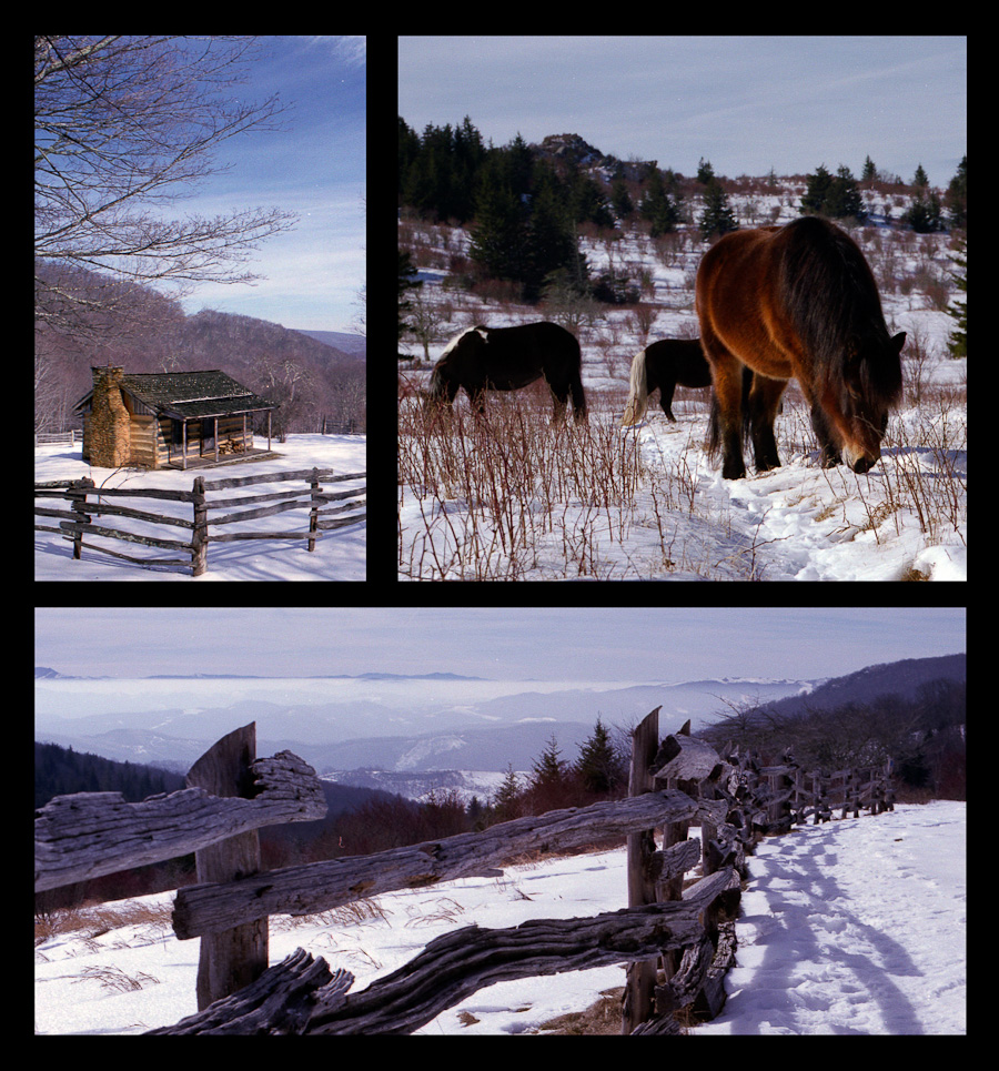
Martin Seelig put an effective spin on the typical triptych layout creating a collage effect, rather than the long horizontal display. Showing off his favorite shooting spot, Grayson Highlands, he’s created a montage showing all the great aspects of the park – historic places, wild ponies and vistas! The three images compliment each other so well – not only with the complimenting colors, but the composition and placement of the photos. The fences create the leading lines and you just can’t take your eye off the almost velvet color in the pony.
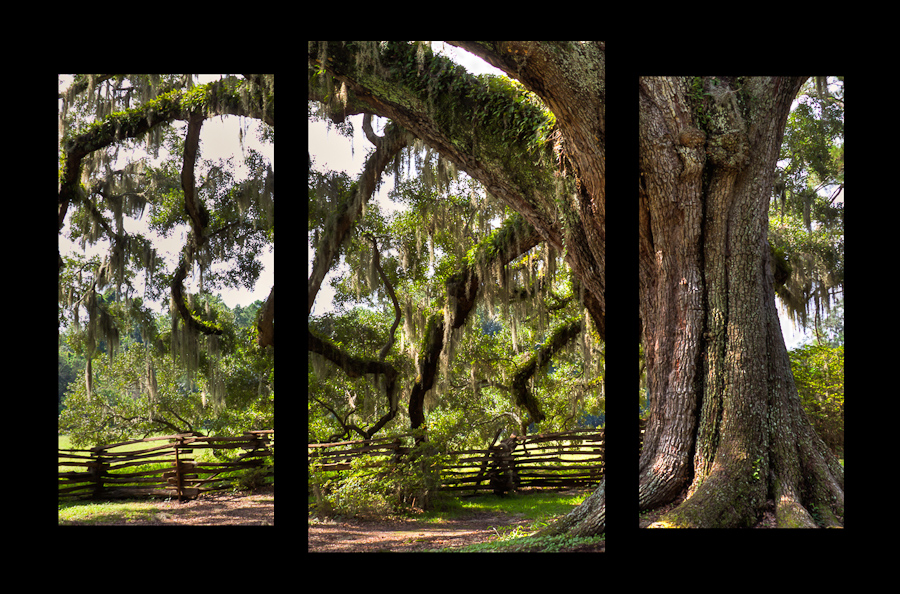
Tied for the member’s second choice is Kim Hadley’s single shot of a huge live oak photographed in South Carolina. Triptych’s are not always made up of three separate images. In this layout, Kim was using the triptych format to convey the size of the subject. This tree is massive and the imagery of its size is much more pronounced as the branches extend from one image to the next, and the next, and further still beyond the edges.
Third Place (11 Votes)
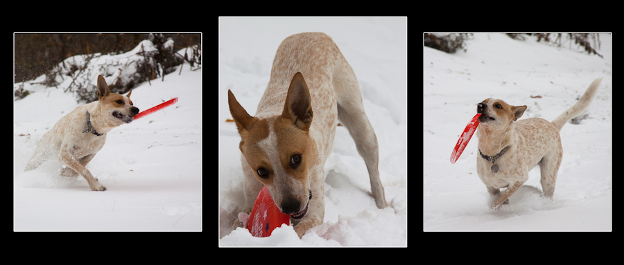
Voted the third favorite is Kim Hadley’s tribute to Molly’s love of snow. Triptychs are great for showing the passing of time. As in this case, it’s obvious Molly was here, there an everywhere as she truly enjoyed her romp in the snow with her frisbee.


All the choices were great. I continue to be dazzled by Betty. Who co uld possibly perceive that she is new to digital photography??? Then again, Betty has a long history of doing an extraordinary job of everything she takes on.
Congratulation!!!! Betty.
congrats to each one (especially YOU Kim with TWO) on these wonderful images..