A “Still Life” gives the artist perhaps more freedom to convey a specific message in a visual presentation than other categories such as portraiture or landscape. Every element of the work is under the direct control of the artist, from the objects chosen, to the arrangement of the objects, to the lighting and background. There’s no rush to catch the perfect time of day or a fleeting light or changing weather. Elements can be removed or added over an extended time until the artist is satisfied with his arrangement. Or, in the case of photography, multiple shots from a different perspective or different light sources can be attempted, until a finished work reflects the artistic intent. The ACC members who participated in this assignment took advantage of this freedom and produced some excellent results, making the voting a very difficult choice to determine the member’s favorite.
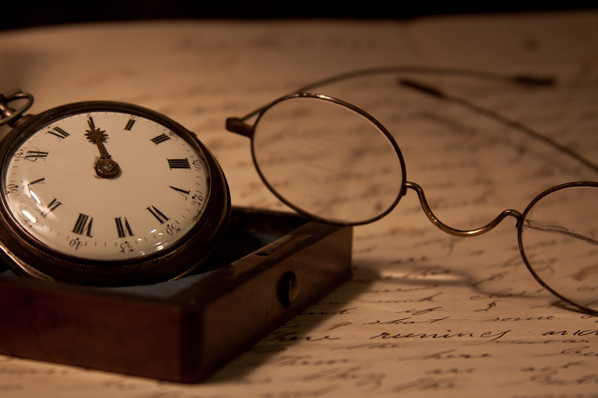
The overall favorite below was created by Kim Hadley, a very simple but powerful composition of times past with a pocketwatch and pair of glasses, all set in a warm environment of soft light and a muted, wqrm sepia color. The handwriten paper makes an ideal background. The shallow depth of field is perfect.
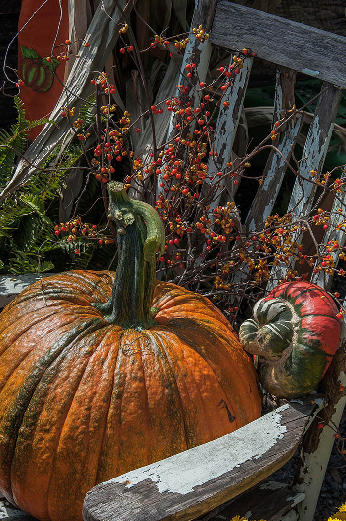
The second place winner goes to Sandy Pinto for an autumn themed look at an artistic and colorful arrangment of objects typically associated with that lovely time of year. Set in a weather beaten and peeling chair and in a somewhat muted light, the feeling of the end of summer, the coming winter cold and the passage of another year is conveyed to the viewer
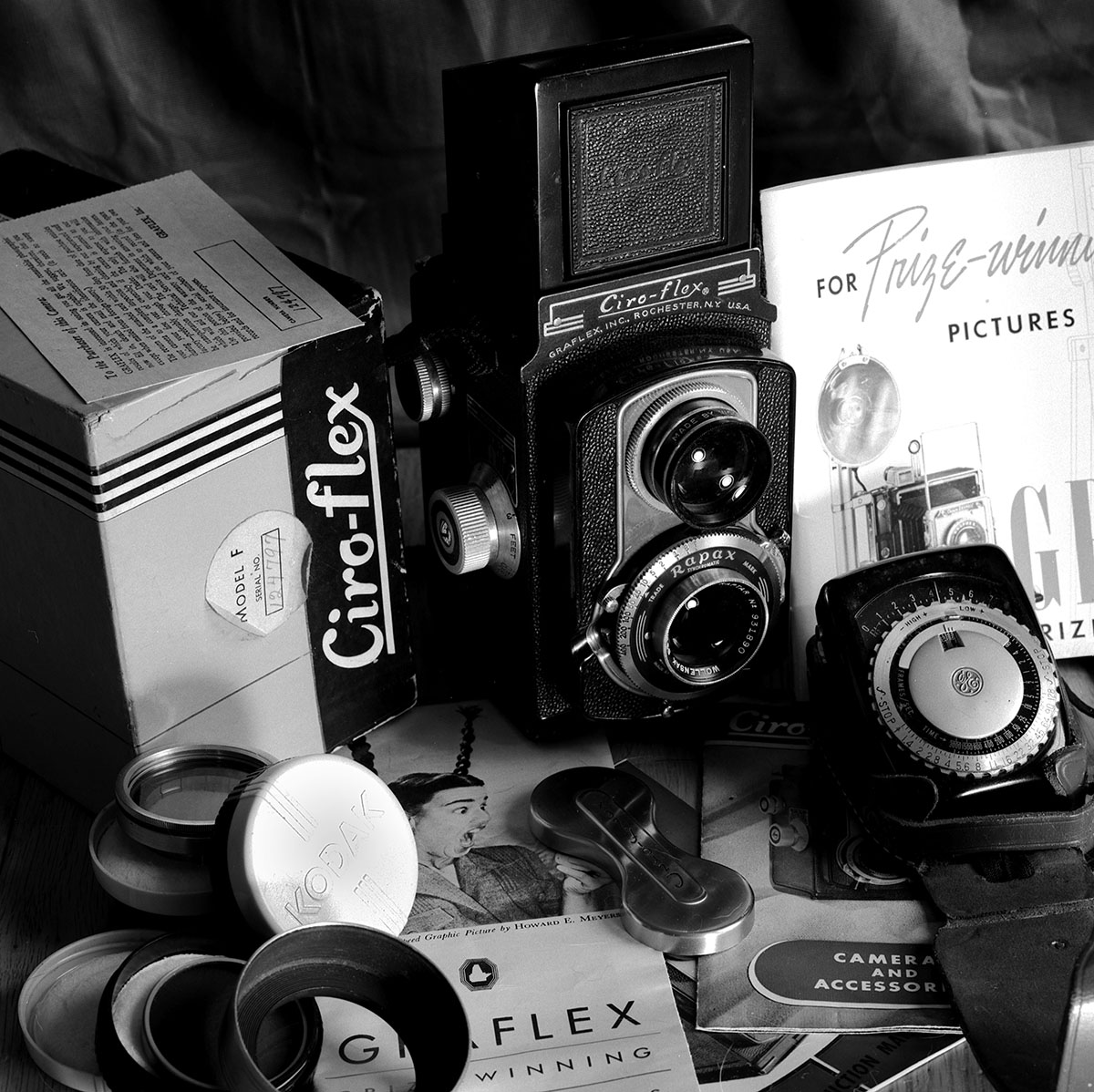
Only one vote behind Sandy is this work by Martin Seelig successfully portraying his love for film photography using vintage cameras. It’s obvious that he selected the various pieces carefully and arranged them exactly as he wished. He included not only the Ciro-flex twin reflex camera but all the items that would come with the purchase. The addition of the lightmeter completes the story. It’s only natural that he would choose b&w for his presentation.


