When Three May Be Better Than One

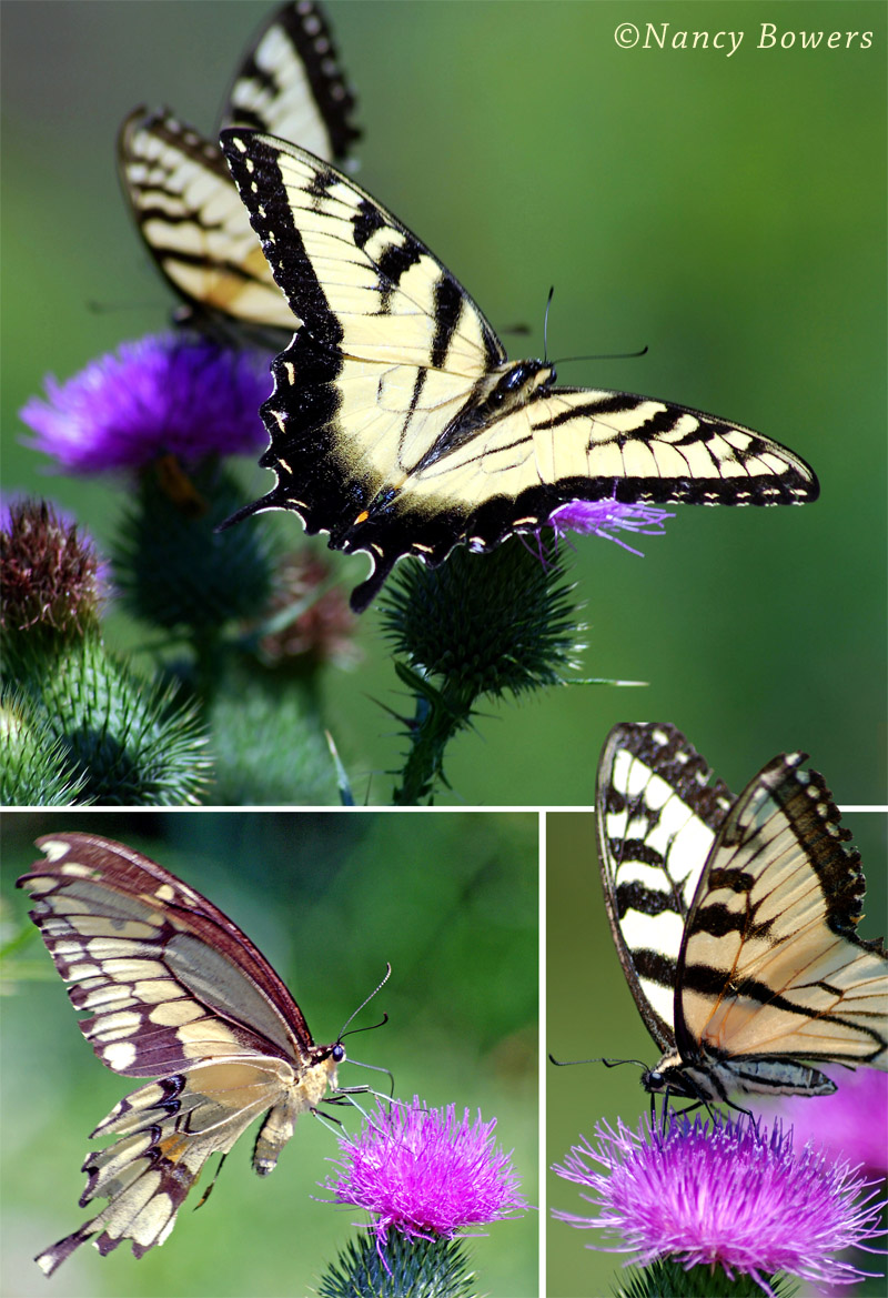
Nancy Bowers – Butterfly Montage
There were no submissions this week for “Photographer’s Choice” so rather than let a week go by with no new posting, I’ve looked through some of the many excellent member submissions and selected the above to share. It is of course a montage of images captured on an active summer day when butterflies were busy visiting the colorful thistle. Each of these could stand on its own but sometime judicious cropping and arranging can create a more compelling image. This may be the case here. The colors are vibrant, the creatures are captured at different angles and the backgrounds are so similar that arranging the three in an attractive layout works extremely well. Allowing one image to extend beyond its “boundary” creates a different look and perhaps adds interest.


Anyone who has ever tried to shoot a butterfly has got to appreciate these shots! Those bugs are quick! Great job Nancy!
In one word, “Beautiful”!
I’m not as verbose as 5MbG, so I’ll just say excellent shots and post processing
When I first saw the email coming in with the subject title including the word “Montage” the only word that came to my head was “Nahhhhh!” – when I opened it I changed my mind, most unusually, as I was pleasantly informed how well the three images were put together, with much time invested in composition, a golden section tease, and just good effect! In addition the background is a really pleasant unifying element, in its own right.
To punctuate the excellent design principles employed, the protruding elements of the wings to the image above provides further interest and depth. This was an early Italian Renaissance device used by such masters as Sandro Botticelli who liked causing the nimble footwear of the nobility to protrude in front of floor elements and frames, nudging forward “for the edification of the observer” – eg, his painting “Fortitude” shows this example, way before the advent of Adobe’s Photoshoppe!
I like the montage, thank you!